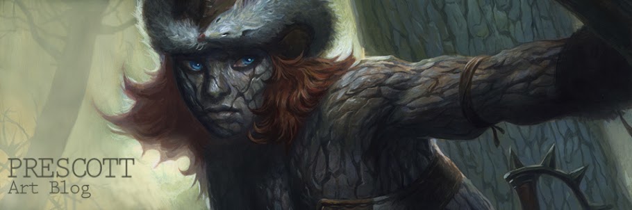
Garruk
So here they are in all their black-n-white glory: the Magic:the Gathering M14 Planeswalker promo card illustrations. Wow, such a long title - but, as I have heard on the internet vine, deservedly so. At least for now, those little cards are VERY highly coveted. The project however, didn't start out as illustrations for exclusive promo cards that you could only get at the San Diego Comic Con.
Jace
I was originally commissioned to do these planeswalker images as multi-use graphics that would go on t-shirts and a few other sundry M:tG products not directly part of the game itself. Much to my delight and excitement, a little while after I had completed these illustrations, Wizards decided to use these very same pieces on the aforementioned SDCC exclusives - a pretty damn big deal. Planeswalker cards are popular in the Magic community - let alone extremely rare exclusives like this was to be. And yes, I was compensated for the switch in primary use of the images (
a nice little surprise bonus just before Christmas last year!)
Lilliana
About the illustrations themselves well, not only was it a switch in technique for me from full-color painting that I'm used to these days to a straight up black-n-white, but it was also a different way of approaching the black-n-white imagery as well. My art director (and long-time friend) Matt Cavotta pushed me to drop reliance on lines to define form and shape and trust in a harsh, singular light source and shadow to make the image work. This took some time for it to click as I had filled my freelance schedule for years and years on black and white pen-n-ink work - almost all of it defined by the linework of the drawing. It was very easy to slip back into my old habits and take a more "comic book style" approach using lines and stylized shading, etc. But Matt kept nudging me in the right direction until finally I saw exactly what he wanted. After that moment, it became really fun to do these.
Ajani
The images that are shown here (
and used on the final cards) are technically mixed-media. They started out as mars black acrylic on bristol paper but through a lot of back and forth with Matt, we ended up cleaning up parts and portions of each one to make them stronger images. Most of it was "simplifying" - that is, just dropping unnecessary details in favor of larger areas of positive shapes or negative space. Lilliana and Garruk required a little bit more attention to make the lighting situation work better though. All of this, of course, was much easier to do digitally than if I was masochistic enough to rework them traditionally. In the end, I'd say they are probably 90% traditional and 10% digital.
Chandra
So, speaking of the originals of which there has been quite a bit of interest, I will indeed be putting them up for auction. I'm hoping to do so by August 1st. All five will be auctioned together - and yes, I'll have pictures of the actual (untouched by digital retooling) illustrations on the eBay auction. So get your bidding pants on next week!


No comments:
Post a Comment